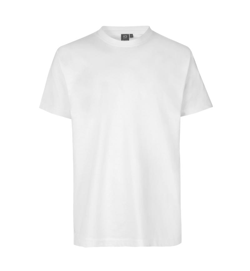
 New
PRO Wear T-shirt
No. 0300
+11
kr. 139,00 (kr. 111,20 excl. VAT)
Track B
This is the package the public site is built from. Everything below is the real component, imported from @id-identity/ui and rendered by this page. Nothing here is a screenshot or a copy of the markup, so a specimen that stops working stops the build.
The tracks swapped roles in D98. What a visitor reads, browses and is convinced by is React; what the commerce engine owns, meaning carts, prices and the order lifecycle, stays in DynamicWeb. The Razor partials for that half are catalogued separately, and the two sets answer to the same tokens and the same rules.
Components
85
counted from the package source
Entry points
19
counted from package.json
Version
0.2.0
installed by tag
Looking for the other half? The Razor catalogue holds the partials DynamicWeb renders behind the transaction.
The package is consumed from a git tag, and its built output is committed like every other generated artifact here. A consumer loads the token stylesheet, extends Tailwind from the shipped theme, and imports from the entry point it needs.
"@id-identity/ui": "github:klhpicture-jpg/id-partner-room#ui-v0.2.0&path:packages/ui"
Seven of those entry points ship a use client directive and the rest do not. That split is asserted on every build by pnpm pack:check, which installs the tarball into a stricter consumer than this repo and typechecks it, because a component that silently becomes a Server Component fails at the first piece of state and says nothing on the way.
@id-identity/ui@id-identity/ui/layout@id-identity/ui/product@id-identity/ui/commerce@id-identity/ui/sections@id-identity/ui/chrome@id-identity/ui/buy@id-identity/ui/form@id-identity/ui/overlay@id-identity/ui/Icon@id-identity/ui/icons@id-identity/ui/image-contract@id-identity/ui/IDLogo@id-identity/ui/ProductImage@id-identity/ui/CopyLinkButton@id-identity/ui/PrintButton@id-identity/ui/data@id-identity/ui/data/charts@id-identity/ui/tailwind
The pieces an application is assembled from: surfaces, actions, status chips, waiting states and the empty case. Token utilities only, and no import from any host app, which is what makes the package portable.
import { Button, Badge, Card } from '@id-identity/ui'
ButtonFive variants, two sizes.Button pendingaria-busy, never disabled: a disabled submit is dropped from the form data along with the cart command.BadgeThe quiet B2B status family.ActionsTwo actions that share a moment.Order 41028
Placed 28 August by Mette N.
Card is a surface. It carries no domain knowledge, which is why an order, a budget and a user list can all sit in one.
Card, CardHeaderSkeleton, SkeletonTextA placeholder earns its place only when it has the shape of what replaces it.Recalculating basket total
PendingNoteA wait that belongs to a region.Open orders
12
Across 3 sites
StatCardOrders placed by your colleagues appear here once approved.
EmptyStateThe title is a heading, so it lands in the page outline.ProductImagePlaceholderCardCardHeaderBadgeActionsButtonSkeletonSkeletonTextPendingNoteStatCardEmptyStateProductImagePlaceholder
Page structure as components rather than as remembered class strings. Width, rhythm, the twelve-column grid, and the type roles that go with them. A heading level and a type step are separate props on purpose: an h2 is allowed to look small.
import { Container, Stack, Heading, Text } from '@id-identity/ui/layout'
Workwear that lasts
Text with measure caps the line length so a paragraph stays readable. It reads from the same type scale as everything else, which is why a rebuild of the tokens moves this sentence too.
The typography rulesHeading, Eyebrow, Textlevel sets the outline, step sets the size.GridTwelve columns, named spans.Section carries the band, Container carries the measure. Nesting them is how every page on the public site is built.
Section, ContainerTone and width in one.A full-bleed band inside a measured column.
BleedEscapes the container without leaving the grid.ContainerBleedStackGridSectionHeadingTextEyebrowLink
A card is not always buyable and a price is not always there. State suppresses the buy affordance and joins the link's accessible name, so nobody discovers on arrival that the garment is gone. B2B prices need a login, so an absent price is a state rather than an empty string.
import { ProductCard, ProductGrid, ProductGridItem } from '@id-identity/ui/product'
NewNo. 0300
kr. 139,00 (kr. 111,20 excl. VAT)
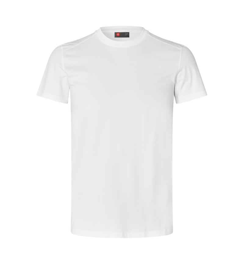 Campaign
No. G21000 · S to 4XL
kr. 159,00 (kr. 127,20 excl. VAT) Previous price kr. 189,00
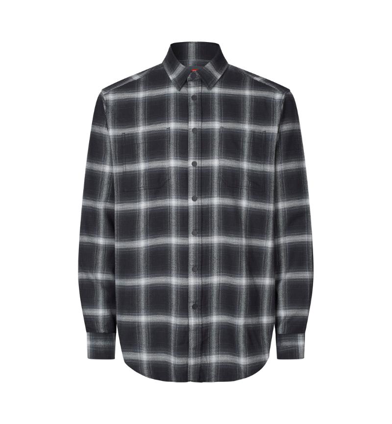
No. S64
Sold out · request a notification on the product page
No. 0510
From kr. 189,00 (from kr. 151,20 excl. VAT)
Volume pricing from 10 units
Third card: sold out, so the quick-buy slot is suppressed and the link reads "SEVEN SEAS Flannel unisex, No. S64, sold out". Fourth: no image, a From price with a volume note. Hover the first card for the quick-buy reveal.
The heading states why these products (D49); "Selected products" is a shrug.
No. 0300
No. G21000
ProductCardProductGridProductGridItem
Everything a product surface stands on that is not the card: prices with commercial context, stock as shape and word, filters as links, tables built for 200 rows, and the seam pieces around a buy. Each is its Track A partial's contract, classes verbatim.
import { DealerPrice, StockIndicator, FilterBar } from '@id-identity/ui/commerce'
kr. 139,00(kr. 111,20 excl. VAT)
kr. 119,00(kr. 95,20 excl. VAT)Previous price kr. 139,00Spar kr. 20,00
kr. 94,52kr. 139,00-32%Your net price excl. VAT
Price on requestRequest a price for the selected quantity and customization.
DealerPriceWho you are decides which number leads: public, campaign, dealer, request.In stock· 1.240 units
Low stock· under 50 units
Sold out
Backordered· expected week 40
Discontinued
StockIndicatorFive states; sold out is a hollow ring, so the dot survives greyscale.No. 0300 · PRO Wear T-shirt
ArticleNumber, CertBadgeRow| 1 to 9 units | kr. 111,20 |
| 10 to 49 units | kr. 103,40(your current price tier) |
| 50 to 99 units | kr. 97,80 |
VolumePriceTableTiers stated before the till; the current tier marked, never celebrated.BreadcrumbThe current page is not a link; JSON-LD comes from the same trail.FilterBar + FilterPanelEvery filter change is a link; a zero-count value stays visible as text.| Item no. | Product | Quantity | Price excl. VAT |
|---|---|---|---|
| No. 0300 | PRO Wear T-shirt, navy | 240 | kr. 26.688,00 |
| No. S64 | SEVEN SEAS Flannel unisex | 48 | kr. 14.352,00 |
TableHairlines, mono headers, tabular numerals.FlashMessageNot a toast: in flow, until the next navigation.Add kr. 339,40 excl. VAT to reach the free-shipping threshold. Otherwise kr. 49,00.
FreightProgressArithmetic, never pressure.SizeChoiceRectangles choose, pills act (D30). Native radios; the chip is the label.| Size | Chest | Waist |
|---|---|---|
| M | 96 | 86 |
| L | 104 | 92 |
| XL | 112 | 98 |
SizeGuideTableThe size column is sticky; nothing hidden, nothing stacked.PaginationA list of links; the greyed edge is not a disabled button.ArticleNumberCertBadgeRowStockIndicatorDealerPriceVolumePriceTableBreadcrumbPaginationShowMoreTableFilterBarFilterPanelSortSelectFlashMessageFreightProgressSizeGuideTableSizeChoiceNotifyMeBuyBarSearchSuggest
The editorial furniture a content page is composed of, and the navigation that carries it. Hero, Footer, Navigation and CookieConsent are full-bleed surfaces; the two band pieces below render live, and the rest are proven by the same jsdom and axe suite as everything else.
import { Hero, StatsBand, Footer } from '@id-identity/ui/sections'
GarmentStripThe category streets under the hero: links only.Example figures
StatsBandThe inverse statement band; figures in the sans with tabular-nums (D53).HeroHeroMediaEditorialSplitEditorialMediaStatsBandGarmentStripNewsletterSignupFooterErrorPageCookieConsentNavigation
The two client pieces of a purchase. The stepper wraps a real native number field, so it posts like any form control and a dealer can type 48; the quick-buy drawer is a native form, deliberately not a mini PDP.
import { QuantityStepper, QuickBuy } from '@id-identity/ui/buy'
Quantity
Sold in multiples of 10 · minimum 10 units · In cart: 20 units
Quick buy
QuantityStepperQuickBuy
An autocomplete token is required by the type system, which is this system's version of the autocomplete rule: a checkout field that a browser cannot fill is a field a customer types wrong. Optional fields are marked, required ones are not, and the error summary is the first thing focus lands on after a failed submit.
import { Input, Select, ErrorSummary } from '@id-identity/ui/form'
The microcopy the components supply themselves is Danish: (valgfrit) on an optional field and Der er noget at rette above the error summary. That is deliberate for a Danish-market shop and it is also the part that has to become translatable before the package ships a second language. Every string a page passes in is the page's own, which is why the labels below are English.
Eight digits, no spaces.
Enter an email address, for example mette@firma.dk
InputRequired, with a helper, and in error. Only the optional ones carry a mark.Optional. Reaches the driver, not the warehouse.
Select, TextareaCheckbox, RadioGroupCorrect 2 fields
ErrorSummaryRendered above the form, focused on submit, every message a link to its field.FormFieldInputTextareaSelectCheckboxRadioGroupErrorSummary
Dialog and Drawer are the native dialog element, so the focus trap, the Escape key and the top layer come from the platform rather than from a library. Tabs is hand-written to the ARIA pattern with a roving tabindex, because a tab set is small enough that a dependency costs more than it saves.
import { Dialog, Drawer, Tabs } from '@id-identity/ui/overlay'
60 % cotton, 40 % polyester, 210 g/m². Arrow keys move between tabs; Home and End jump to the ends.
S to 6XL. Only one tab is in the tab order at a time.
60 degrees, tumble dry. Selection follows focus.
DialogDrawerTabs
Tier 0 is layout and stays CSS on every surface: a stat tile, a bar list, note boxes, an empty state. Tier 1 needs a scale or an axis and goes to Recharts. Colour follows the entity and never the rank, series order is fixed, and data never animates.
import { StatCard, BarList, Callout } from '@id-identity/ui/data'
Reorder rate
68 %
+4 pp compared with the previous quarter
Example data
StatCardFrom ./data: delta, basis, sparkline.| Name | pieces | Share |
|---|---|---|
| PRO Wear T-shirt | 1.425 | 42% |
| GEYSER active T-shirt | 980 | 29% |
| SEVEN SEAS Polo | 610 | 18% |
| Other | 340 | 10% |
BarListCalloutFive variants, role=note.Widen the date range, or check whether the site has ordered under a different account.
Clear the filterEmptyStateFrom ./data: icon in flow, one exit.| Period | T-shirts | Polos |
|---|---|---|
| Week 31 | 1.240 | 820 |
| Week 32 | 1.310 | 795 |
| Week 33 | 1.180 | 910 |
| Week 34 | 1.425 | 980 |
| Week 35 | 1.390 | 1.040 |
TimeSeriesChartRecharts, fixed series order.| Period | pieces |
|---|---|
| S | 210 |
| M | 480 |
| L | 520 |
| XL | 390 |
| 2XL | 180 |
CategoryBarChartOne axis, always.StatCardBarListCalloutEmptyStateChartFrameTimeSeriesChartCategoryBarChartSERIES
Seven small modules that would each drag a dependency or a client boundary into a bigger file. Importing them one at a time is how a server-rendered page stays server-rendered.
import { Icon } from '@id-identity/ui/Icon'
IconA named icon from icons/icons.json. Decorative by contract, so an icon-only control carries its own label.
IDLogoProductImageClick opens a native lightbox dialog.CopyLinkButton, PrintButtonBoth client components, both with a real failure path.image-contractMeasured from all 28 files in the catalogue, so the browser reserves the right box before the bytes arrive.IconICONSIDLogoProductImageCopyLinkButtonPrintButtonMASTER
Every Track A partial has an answer here, and CI fails when this claim and the code disagree: the map lives in foundations/parity-map.json, and pnpm parity checks that each matched component actually exists. Razor keeps only what the commerce engine owns (D98).
Matched
A React component carries the partial contract, classes verbatim.
Composed by the app
Page recipes assembled from matched pieces; the composition is the page's.
Stays Razor (D98)
Cart, checkout, account and the order lifecycle live where the engine lives.
74 partials45 matched12 composed by the app17 stay Razor
A gallery is a claim. These are the checks that make it one you can rely on, and all of them run in CI on every change.
pnpm testpnpm pack:checkpnpm tw4pnpm check:brandpnpm tokens